Colossians 1:16 states, "For by him all things were created, in heaven and on earth, visible and invisible, whether thrones or dominions or rulers or authorities—all things were created through him and for him.”
A logo is designed to communicate something about an organization. Much thought and prayer goes into this very brief pictoral statement. A logo is meant to have impact. It is meant to draw a person’s interest. It facilitates instant recognition. It conveys values and character, fostering trust and loyalty.
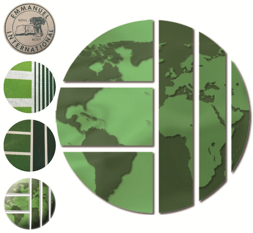
In EI’s 50 years, the logo has undergone at least 5 changes. Initially, the logo showed an open Bible and a sheaf of wheat, demonstrating the organization’s central theme, the Gospel of Christ must go to the world. The original logo from 1975 was updated in 1978.
In 1990, the design was changed to a circle with 3 thick horizontal lines and a number of more narrow vertical lines. The lines were various shades of green.
In this design, the artist was showing
1. The Light of the world shining from Christians (lighter green) into a world (darker stripes) to those outside of Christ.
2. The light in the "unreached" side shows a progression from those who have had the "light" told to them to those "who had not yet heard."
3. The circle is the world and the EI is clearly visible as a means of getting the "light" to darkness."
These central themes have been retained, with the added touch of the world map design by Shawn Boadway in 2009. EI continues to carry the light of Jesus to a world darkened by sin. To God be the glory.